
Like every company, we have a hierarchical org chart with me at the top. It looks something like this:
I have long felt there is a shadow org chart, much like a shadow economy, where employees trade ideas, give direction, offer help, and spread culture. This shadow org chart is built bottom up by employees and is very different from the top down hierarchical org chart set by me.
I wanted to map this shadow org chart and find employees who have disproportionate levels of influence relative to their hierarchical position. I also wanted to see the influence centers and decision makers, and the directional current between them and the rest of the company.
Top down org charts are trees. But bottom up influence charts are network graphs. We used Innovisor to map the network graph for us.
To do this we asked employees three questions:
-
Who energizes you at work? (list 4 or more people)
-
Who do you go to for help and advice? (list 4 or more people)
-
Who do you go to when a decision needs to be made? (list 4 or more people)
Every time an individual was listed counted as a nomination. We connected the nominators to the nominees in a directional graph. The result is the influence network below.
A couple of notes: 1. Trifecta is our term for executives. 2. If you look closely you can see the directional arrows of influence. 3. The larger nodes cluster in the middle.
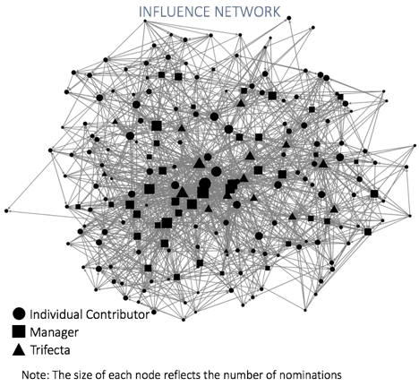
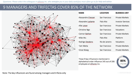
On our first pass of understanding the network we filtered by individual contributors. In red is the smallest group of ten employees that influence the most employees. This is different than the top ten nominated employees. This is a union of ten employees that influences the most employees. This group influences 70% of our 250 employees. That means if we wanted to spread a meme, this is the ten we would start with.
When we looked two degrees removed from the ten influencers (employees influenced by employees influenced by the core group) we were able to influence all 250 of our employees.
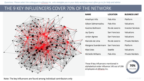
We did the same exercise with managers and executives to find the nine core influencers. They influenced more of our employee base than the individual contributors, but not by as much as we expected. This strengthened the thesis that the undercurrents of interpersonal influence are as significant as the institutional management hierarchy.
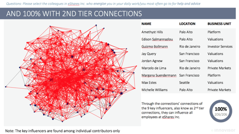
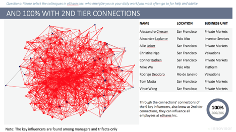
Unsurprisingly, two degrees removed from these core managers we could influence the entire population of employees.
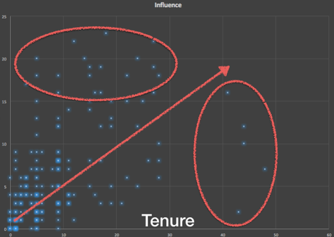
We also looked at a scatter plot of the most nominated employees (plotted against tenure). There is a correlation of influence to tenure, but it is a looser correlation than expected. There are outliers on both sides. Many employees (the top cluster) have an outsized influence in the organization relative to their tenure. On the right are a handful of long-term employees that never reached their influence potential.
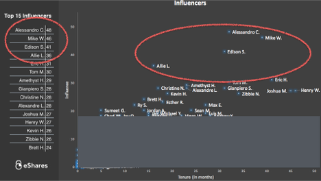
Below are our top 20 influencers with nominations. Impressively, the top four influencers had a combined 171 nominations. Both fascinating and humbling, I am the CEO and didn’t make the top 10.
We hire approximately twenty employees per month. One third of our company has been with us less than 6 months. Since tenured employees have an advantage, we did a new filter to look at new employees. Below are the most influential employees who have been here less than six months.
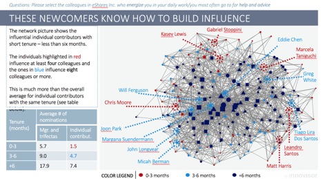
These new employees did something to rocket into high influence positions. The first half of this exercise is to identify our most influential employees. The second half is also to understand how they did it so we can manufacture more of these high influencers.
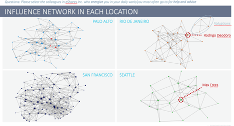
We also mapped the networks by office:
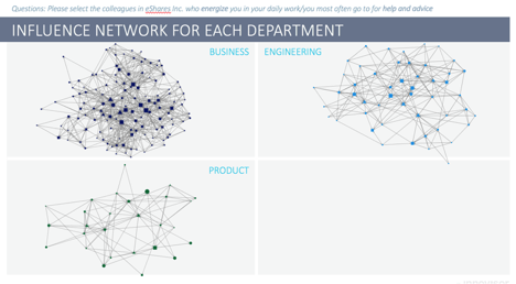
By function (business, product, engineering):
By business unit (Private Markets, Investor Services, Valuations, Capital Markets):
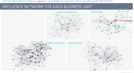
We had a few takeaways from the department, function, and geographic slices.
Some business units and teams are siloed. For example, one cluster of valuations analysts is completely detached from the Rio office. They are only connected through a single node. This happens to be our newer mobile team.
Smaller offices have more key influencers relative to the size of the office. For example, one of our first product designers is connected to almost every node in the Seattle office.
Dunbar’s number is much fewer than the conventionally accepted 150 people. Our offices become increasingly disconnected after approximately 50 people. Smaller offices are better.
Each office develops their own culture and shadow org chart. The shadow org chart crosses business units and functions but is tightest through geography. Tribes form most consistently through physical proximity.
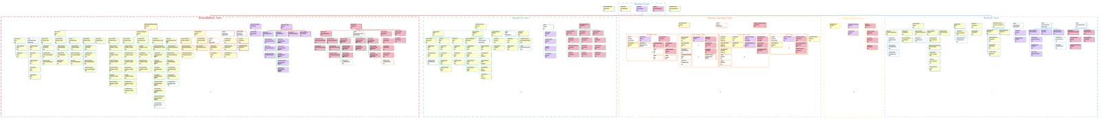
There were a number of other conclusions including why employees work at Carta, how they find help, and how decisions are made. I’ll leave those for a future post. But if you’d like to dig in you can access our Innovisor final presentation here.